Learn the Trick to Making Pop Art Cards That Really Pop!
Pop Art
The Pop Art movement of the late 1950s through the 1970s wanted to bring art back into the daily life of average people. It was a reaction against abstract painting, which pop artists considered as too sophisticated and elite. Pop artists’ chosen images were objects from everyday life such as Campbell’s soup cans, bubble-gum comics, or appropriated advertisements.
Choose Your Image
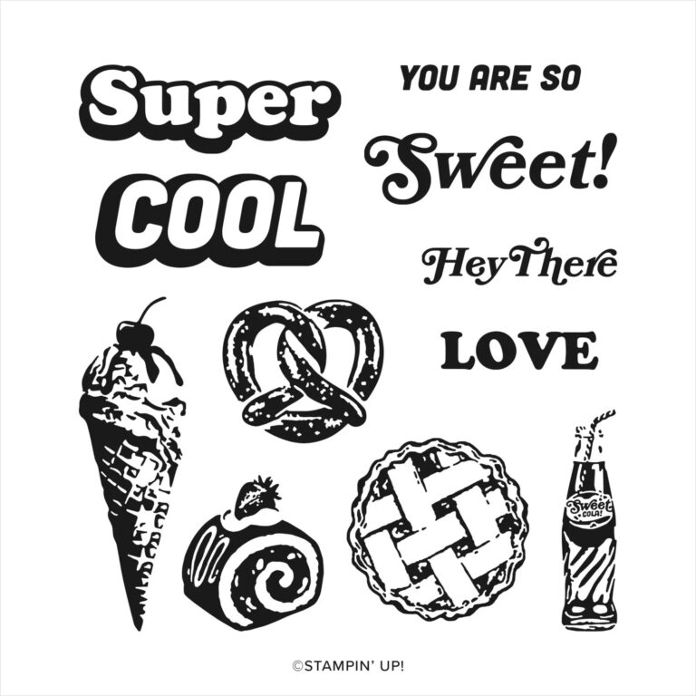
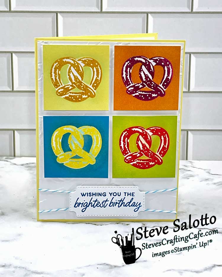
When creating a pop art card, choosing the right image is probably the most essential step. Search your stamps and look for a bold image with thick lines. Something retro would certainly be a good option, or a “common” object, an item you might find around the house, for example. Think “fun” when making your choice. This image will be repeated 4 times on your card so you want it to be something that will connect with people and maybe make them smile like, for example, the pretzel from the “Super Cool” stamp set that I used or… a soup can maybe.
Know Your Steps
As all crafters know, the order in which you do things can yield drastically different results. For this “super cool” pop art card, you need to start with the image. Cut out 4 squares of white card stock 1⅞” x 1⅞” and stamp the image in the center of each, using 4 different colors. But wait! Before you do this, read the next section to learn the “trick” that will make your pop art pop.
Pop is everything art hasn't been for the last two decades. It's basically a U-turn back to a representational visual communication, moving at a break-away speed... Pop is a re-enlistment in the world... It is the American Dream, optimistic, generous and naïve.
Jim Dine
The Trick
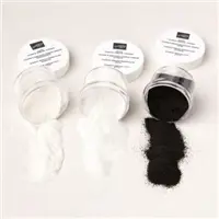
The first time I did this I thought, oh, pretty easy, I’ll just color the background and stamp the image onto it. Uh-un. Didn’t work. The colors blended and muted, and of course there was no white. So, I figured I could stamp the image, emboss over it with clear embossing powder, and then blend the background over that. Pretty smart, huh? Well, no, not really. Actually, no, not at all. As with most stamps, the parts that are intended to stay white are just blank. So, nothing for the embossing ink to stick to means nothing for the embossing powder to stick to means still no white. Here’s a picture of one of those attempts. Yuck, right?
Then it hit me. Eureka! Masking! I needed to stamp on white cardstock (hence the parts meant to be white would be so) and then mask over the entire image preserving the white. I could blend the background over that and the entire image would be protected. By Jove! I think I’ve got it! I decided to still emboss the images in clear powder because the high gloss made me think of pop art of the 80s. Specifically, my favorite, Keith Haring. But you don’t have to. You can stamp the image onto the white square, mask it, and then blend the background. It will still have that retro, pop art tone to it.
Make Your Art
I stamped the image four times on masking sheets, cut them out, and stuck them down over the stamped, embossed image squares. (Truthfully, I did first try to use one mask for all four squares, but the ink from the first one smeared with the ink I was using on the second one, and it got muddy quickly.) Of the four colors I chose, two were the same as two used to stamp the pretzels. (So, that’s six colors total.) I colored the backgrounds with standard blending brushes applied directly to the ink pads and then rubbed in a circular motion onto the cardstock. I repeated this step numerous times, letting them dry each time, until I got the deep, bold colors that I think are evocative of pop art. And lastly, the fun part, the reveal! Carefully peel that masking layer back and look at your masterpiece! Wow! It’s really striking, isn’t it?
Finishing the Card
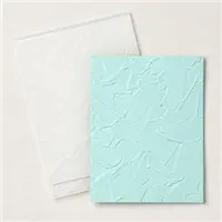
To highlight the “art” and allow it take center stage, finish off the card with minimal elements that don’t distract. White card stock background embossed with the Painted Texture Embossing Folder, a sentiment stamped on white and die cut, etc. And voila! You did it! You are an artist, my dear!
Make it Personal
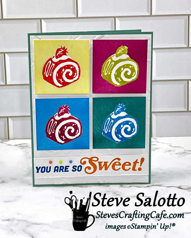
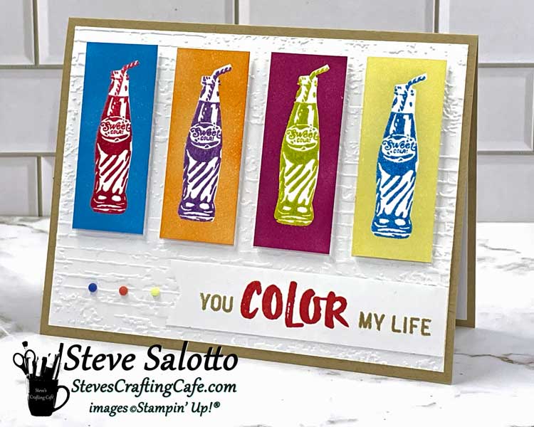
This is such a fun technique, and one I hope you’ll all try. You can add your personal touch by switching up the colors and color combinations, using different objects as the subject matter, and even different background shapes. Below are two alternative cards I made with some of these variations. Both of these feature stamps from the “Super Cool” stamp set from Stampin’ Up! which you can get from me 😊 by clicking here…
The card with the cake is pretty much the same as the pretzel, just with different colors. The one with the soda bottles has a different shape, obviously, plus a different background. I used the Exposed Brick 3D embossing folder on that one. Also, the sentiment is one from my scrapbooking stash and not Stampin’ Up! It’s Concord and 9th, and it just goes so well.
I hope you enjoyed this post. Please “like” it or leave a comment if you want. I would love to hear from you. Until next time, my lovelies, I hope you’re enjoying your summers and that you find the time as always to keep on crafting! -Steve
P.S. Keep scrolling for the list of colors I used as well as supplies You can even download it as a .pdf.
- BACKGROUND COLORS
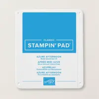
- Azure Afternoon
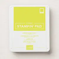
- Lemon Lime Twist
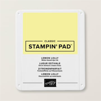
- Lemon Lolly
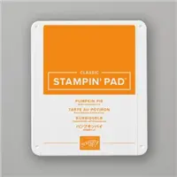
- Pumpkin Pie
- PRETZEL COLORS
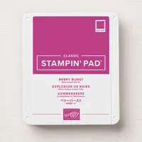
- Berry Burst
- Lemon Lolly
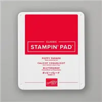
- Poppy Parade
- Pumpkin Pie
Share this:
- Share on Facebook (Opens in new window) Facebook
- Share on X (Opens in new window) X
- Share on Pinterest (Opens in new window) Pinterest
- Share on Nextdoor (Opens in new window) Nextdoor
- Share on Reddit (Opens in new window) Reddit
- Share on LinkedIn (Opens in new window) LinkedIn
- Print (Opens in new window) Print
- Email a link to a friend (Opens in new window) Email
Related
Discover more from Steve's Crafting Café
Subscribe to get the latest posts sent to your email.
